AWS re:Invent 2019
Every year in In Las Vegas, AWS holds the largest cloud computing conference in the world, called AWS re:Invent conference. Serving more than 60 thousand attendees and taking over 7 hotels along the strip, it’s spring break for developers with entertainment in the form of training, certification, workshops, educational sessions, builders’ fairs, networking, and keynote speeches.
Check out our latest work with AWS re:Invent 2020.
Creative Direction
Producing this event employs so many different creative disciplines that AWS looked to us to provide a cohesive creative direction for the entire event. We began with branding the event, providing AWS with a creative concept, design system, and a set of creative principles. This package helped guide decisions big and small, covering everything from graphic design, motion design, scenic design, and experiential design.
Art Direction
In this process, the art direction served as the creative ground that all other creative decisions could grow out from, providing the conference with a systemized foundation for art application across the varying dimensions needed.


Attendee Egress and Flow Strategy
Building on our work from years before, we provided AWS with more efficient site plans and spatial designs to accommodate an ever-growing audience within a static venue space.
Registration and Lobby
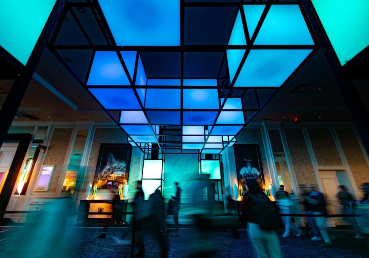
This year we designed a flowing site plan to allow for the efficient movement of 50,000+ people to provide a feeling of transition from the Venetian into the crown jewel of the event, the AWS Expo Hall, held within the Sands Expo. To help support this transition we enveloped the space with a 400 foot long, 20 feet tall curved LED wall that immersed attendees in our art direction as well as several special, environmental animations that played once every few hours, changing the visual and auditory landscape of the area.


The AWS Village
The AWS Village is a landmark at re:Invent and serves as their flagship brand experience for attendees. To touch on AWS’s own principle of accessibility and modularity we created an open space plan by dividing their historic Box logo in visually interesting ways that provided increased throughput and brand touchpoints.


.svg)


-min.jpg)


